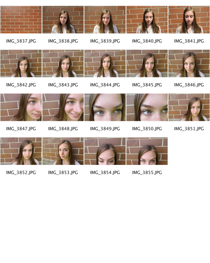
Photo Weaving

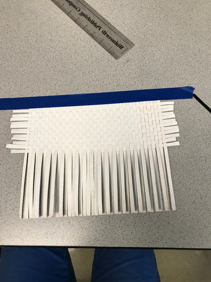
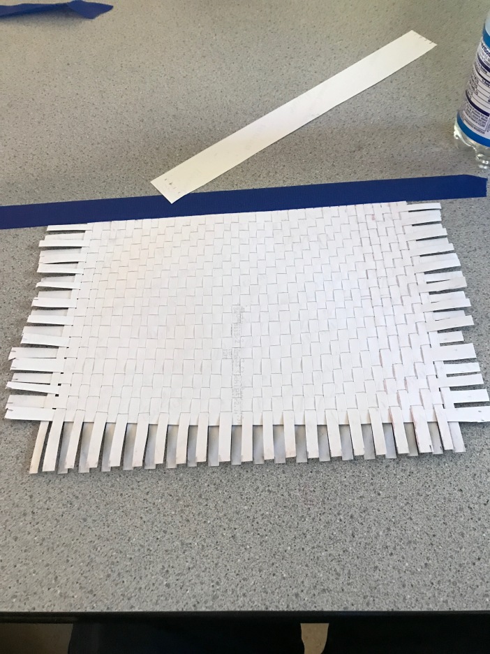
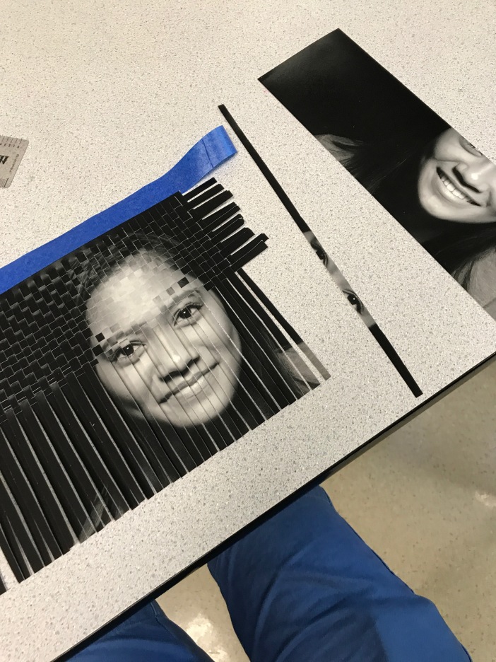
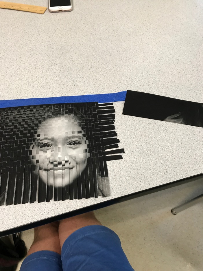
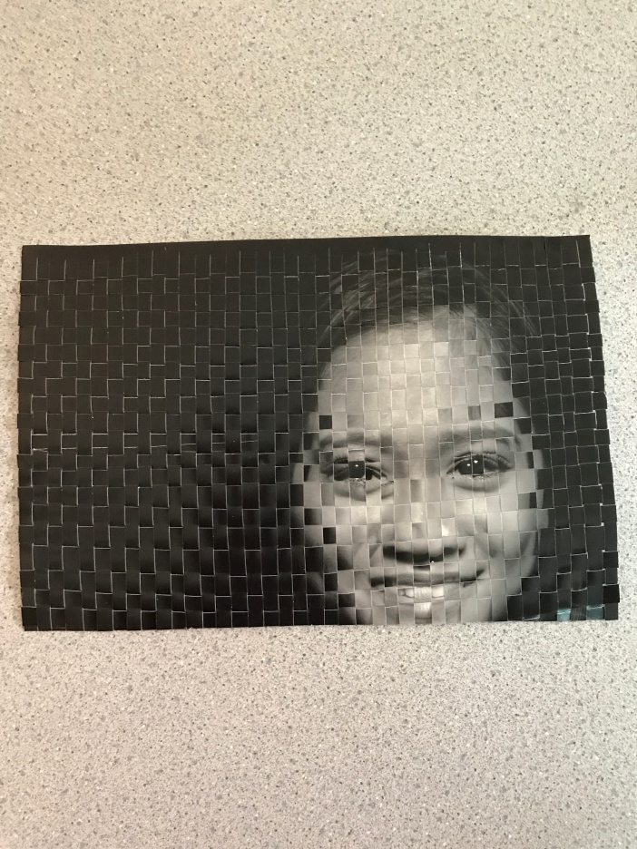
For this assignment, my unique artistic decisions were rather limited because of the rigid nature of this process. With that said, I decided to take out certain strips to make the two photos overlap better (in hind sight I wish I had chosen pictures with more variation). Also, I used different sizes/shapes of strips to add character because the two photos are so similar. Although this wasn’t my favorite process, I appreciate the overall outcome and patience that photo weaving requires.
Composite Images
For Mr. Bower:
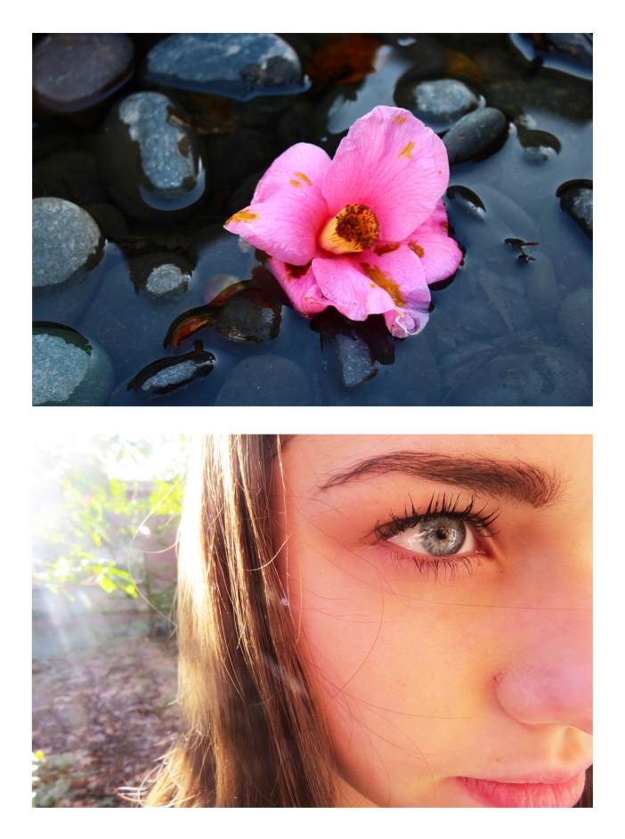
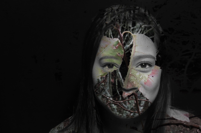
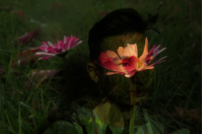
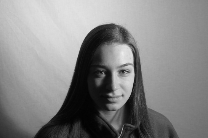
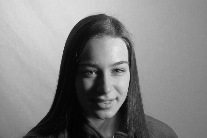
Emotion Diptych
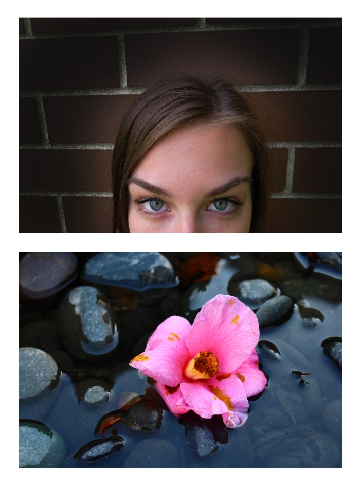
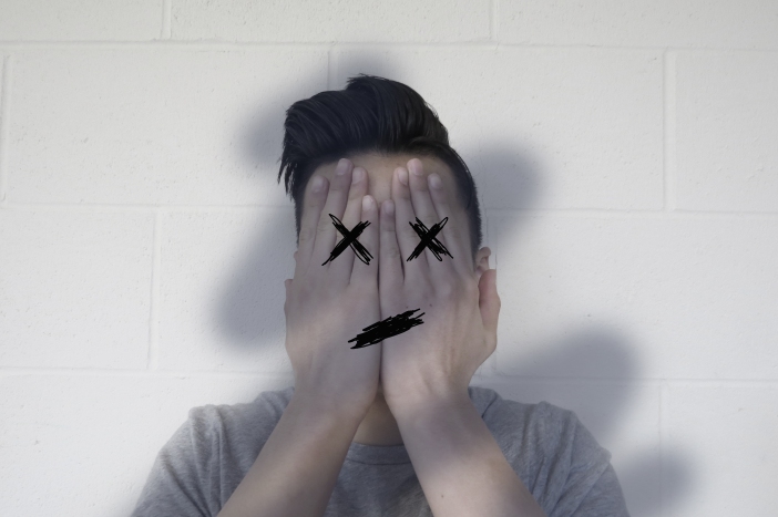
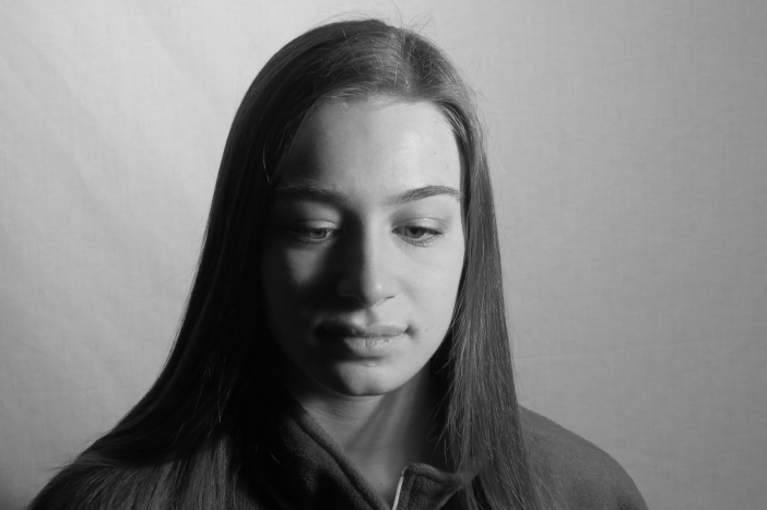
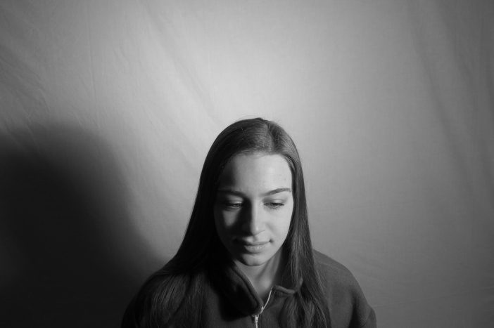
- What was the emotion you photographed?
Entranced
- How did you use composition, angle, expression, light, and gesture to portray this emotion?
I tried to use extreme contrast as well as limited expression and exaggerated high/low lights to portray my emotion. I also increased the light on the subject (and decreased the light around it) in order to add a facet of suspicion–I naturally tie this with the emotion that I was given of entranced, as entrancement needs some curiosity.
- What Elements of Design are in your images?
The main elements of design I used was rule of thirds, shallow depth of field, and extreme contrast.
- What object did you choose to photograph and how does it relate to your emotion?
I chose to photograph a flower for my object in a bed of rocks because its rich colors on the rocks really entranced me when I took it–it is quite breathtaking in its shadows and shape.
- How did you choose to arrange your images in your diptych and why? Think about how your images visually inform each other.
I chose to put Madeline on top because she is in the bottom third of the frame; additionally, her mouth is cut off, so it felt natural to have her on the top half (as if the rocks/flower complete her face. Finally, it gives some parallelism because it is as if she herself is on top of the flower, which it in itself is on top of rocks.
- How successful were you with this project? Would you change anything? Why or why not?
I think that I was fairly successful with the project. Individually the images really depict my emotion–however, if I could change one thing, it would be having a little more color in the picture of Madeline (as this would bring together the two photos better).
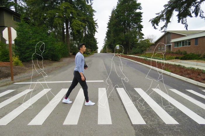
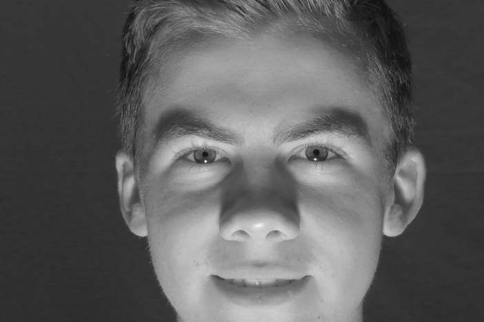
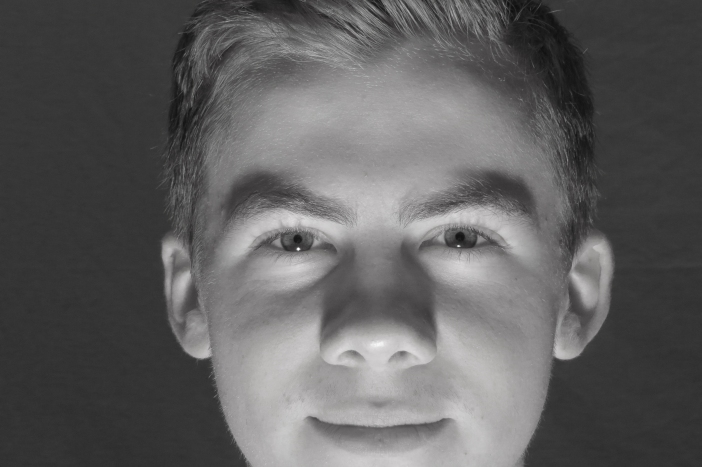
Word Images


Showcase Artwalk
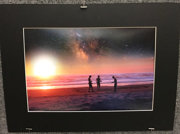
Andrew Arvish — Untitled
This photograph is a very cool multiple exposure/blending style image of three friends on a beach with a sunset and an exaggerated space night-sky.
I really found this image interesting because of the silhouettes of the three friends playing kendama along with how Andrew was able to picture the galaxy instead of a basic night sky. Also the enlarged sky adds an “orb” effect that is very appealing because of the picture’s balance of warm/cool colors.
I myself feel very warm when I look at this picture–almost in a trance. I feel very relaxed because of the colors, and anxious because the still-frame inferred motion.
When I observe this image I wonder how Drew was able to combine two images to add the galactic effect that the skyline encompasses.
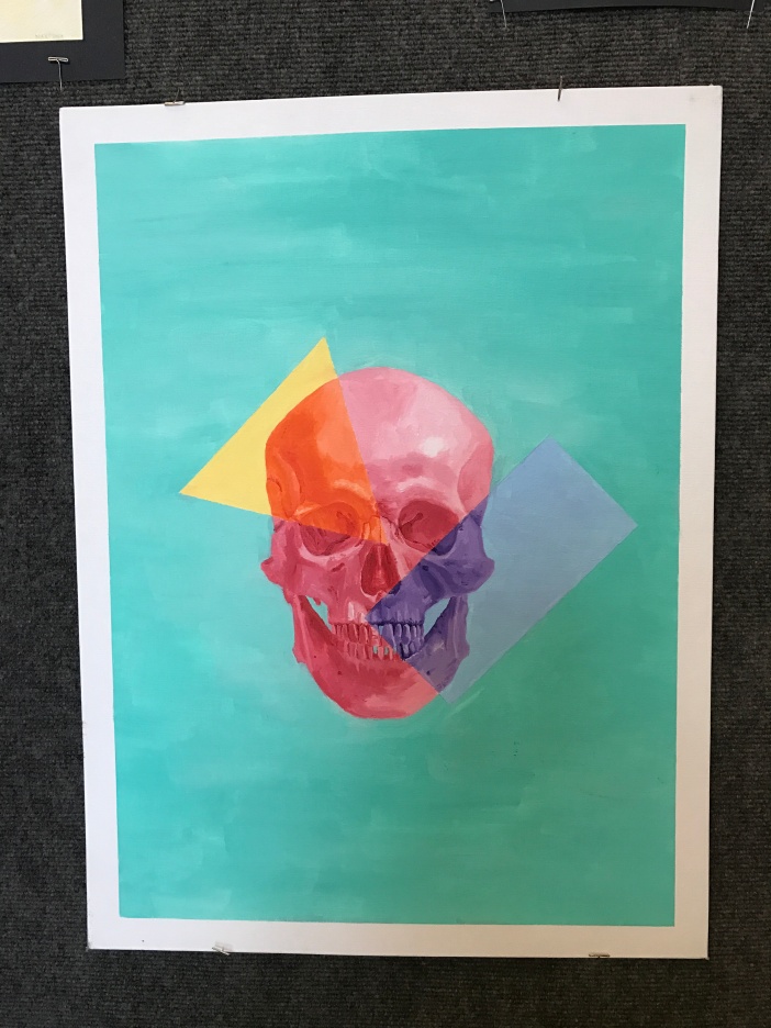
Max Paek — Untitled
This painting of a skull is very intricate, also including the division of color by various shapes that cut in and out of the skull. The placement is simplistic with the skull in dead center, and depth is captured through various shades of the colors.
I find this piece of artwork interesting because of how simple it really is, yet how enchanting and interesting it is at the same time. This division of color through shapes is very cool, especially because the overlapping colors/shapes are those colors mixed. Also, it feels as if the skull is staring at you in the eyes.
I feel almost angry when I view this painting because of the color choice (red skull). However, the blue-ish background adds tranquility that creates a very unique balance. I also feel curious as to who this skull belonged to.
I am very curious about what inspired Max to create this painting. It is so unique that I am curious why he decided to capture a skull, especially with the interesting divisions with shapes.
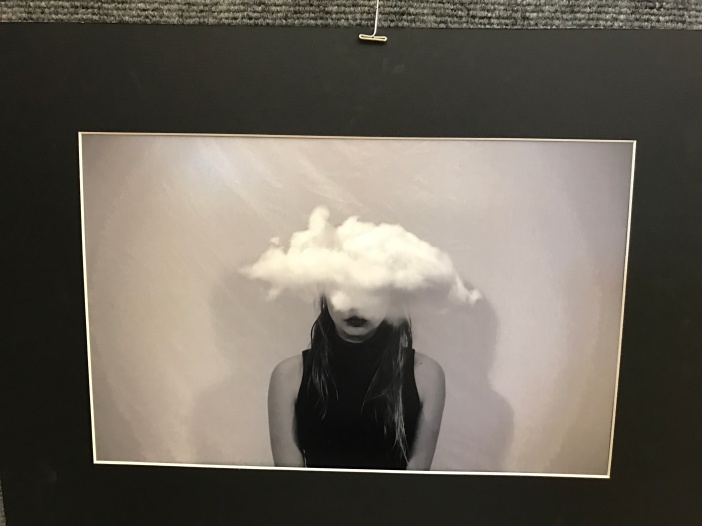
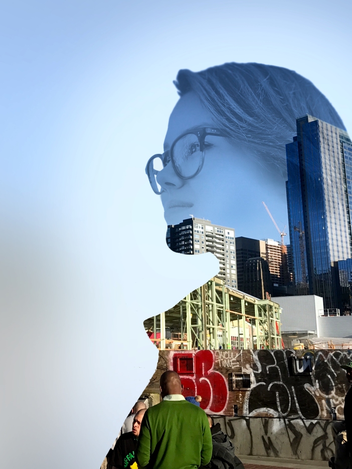
Sophie Hankes — Untitled
This is a multiple exposure portrait image of a girl with a cloud covering her eyes and top of her head.
I find this image interesting because normally a cloud would not be found in a portrait, or in this location/setting. Obviously it was added in post production, but it adds a very cool effect.
I feel sad and depressed when looking at this image because of the monochromatic black/white color balance. Also, the girl is very suppressed to a confined stance/pose.
When I observe this photo I am curious as to how she captured the interesting shadows in the background, as well as the almost textured feel of the image. I am also curious what her emotions were when creating the image, and what inspired her to add the cloud.
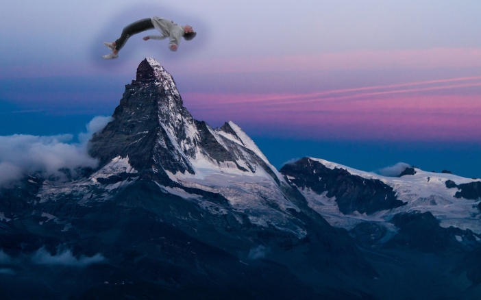
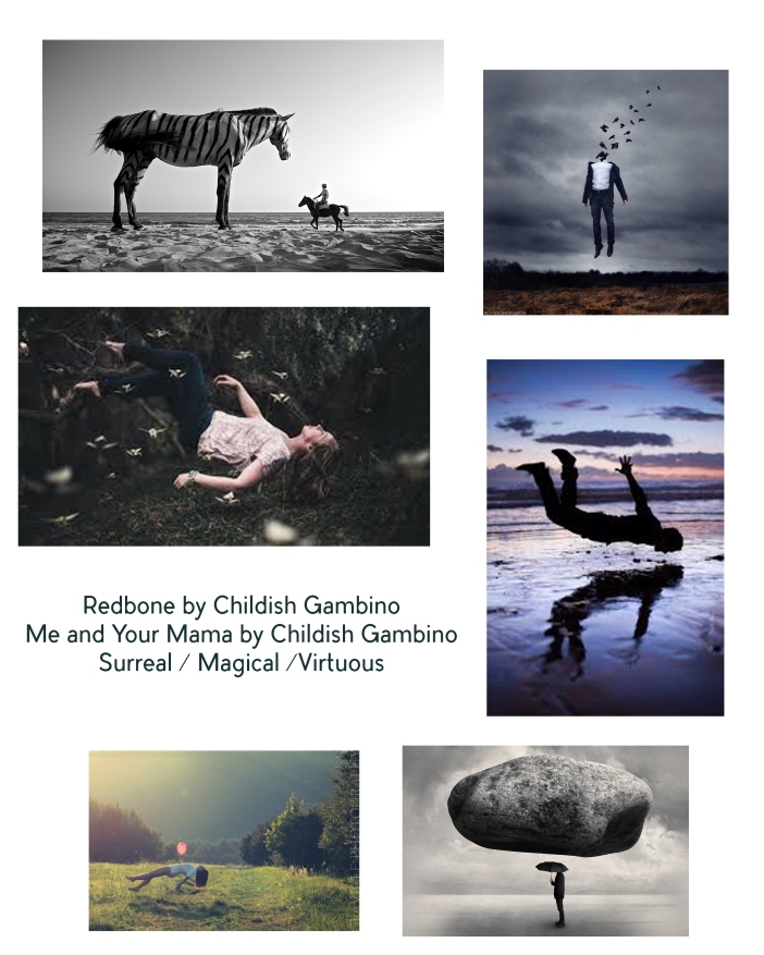
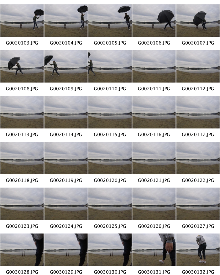
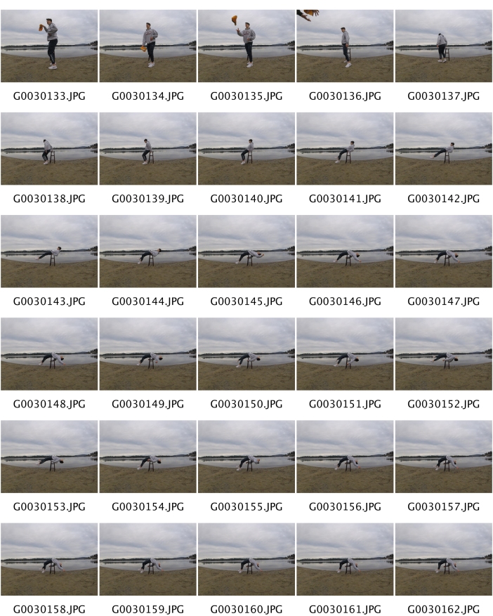
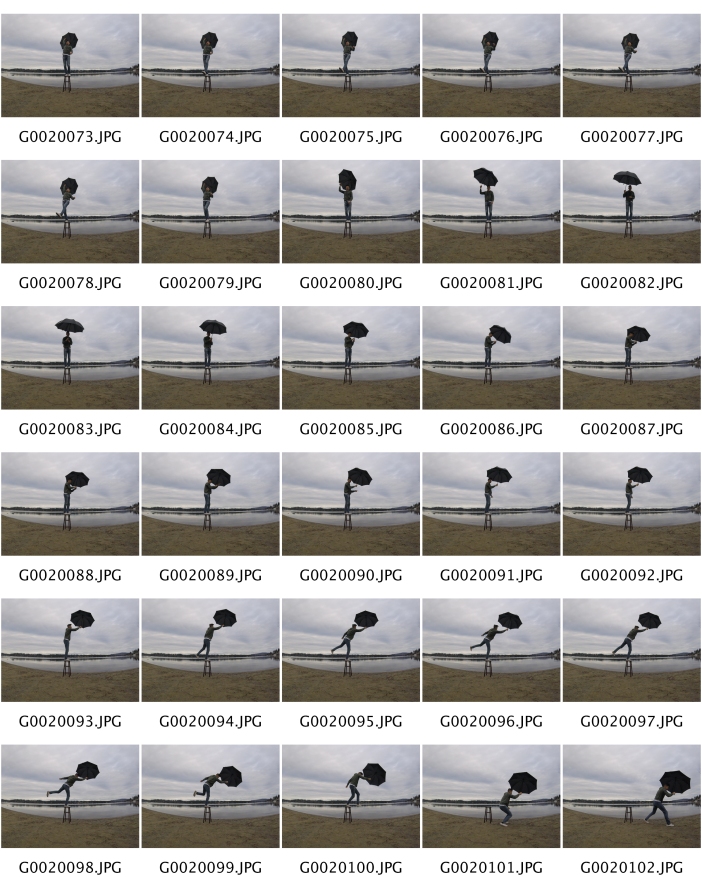
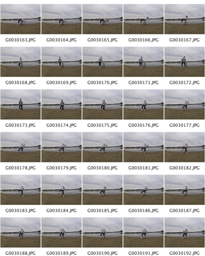
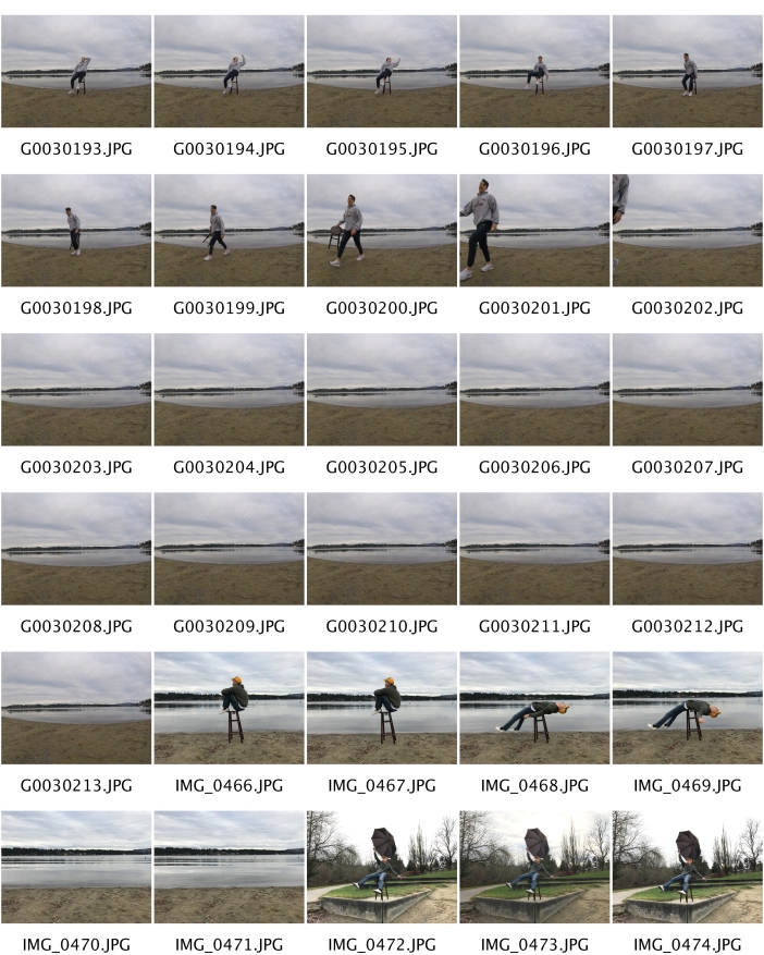
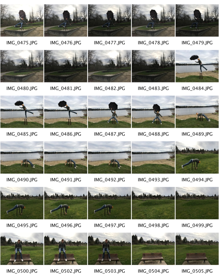
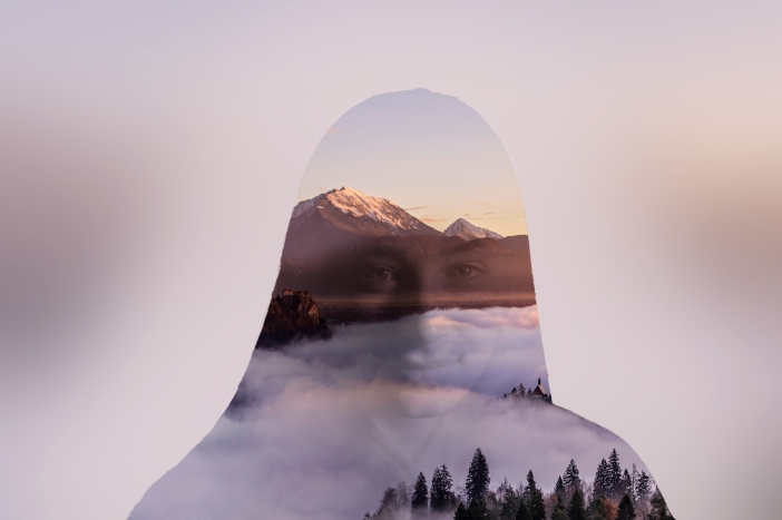
Showcase – Levitation Photography
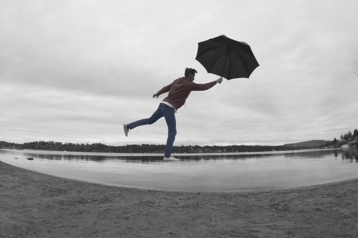
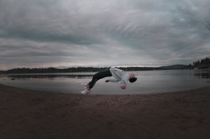
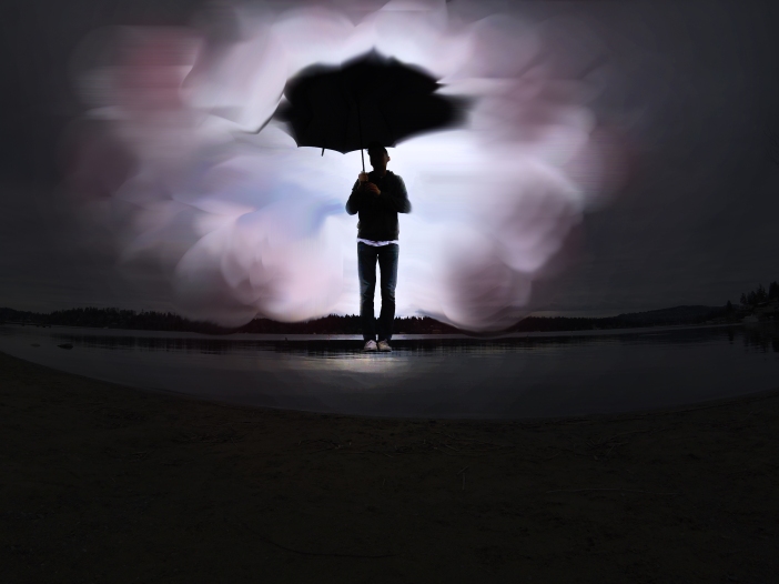
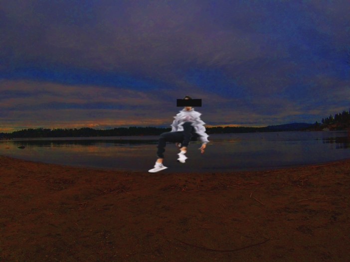
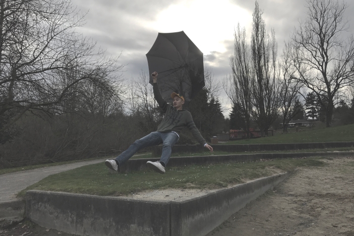
Artist Statement:
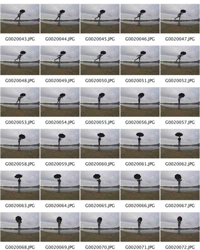
The subject of my artwork features a single person and their surreal connection with the nature that surrounds them. I focused on depicting grace, movement, and melody in a still frame image. I aimed to highlight the dreamlike undertones that made my portfolio of images so enchanting, as the colors are more monochromatic and dreary. This was important to me because of my personal connection with nature, and how the surrounding natural world acts as an enchanting source of revival and spiritual connection for me. I am most proud of stepping out of my comfort zone with the “levitation” effects, especially in the image that I self-captured with a time-lapse setting on my camera with a fish-eye lens. The process involved taking photos both without the subject (neutral background) and with the subject positioned on a stool; in post-production, I layered the two images and masked the stool, giving the effect of levitation. Overall, I loved testing the boundaries of surreal photography while still maintaining the integrity of the original frame, and I will definitely continue to develop these skills.
Imaginarium
Multiple Exposure
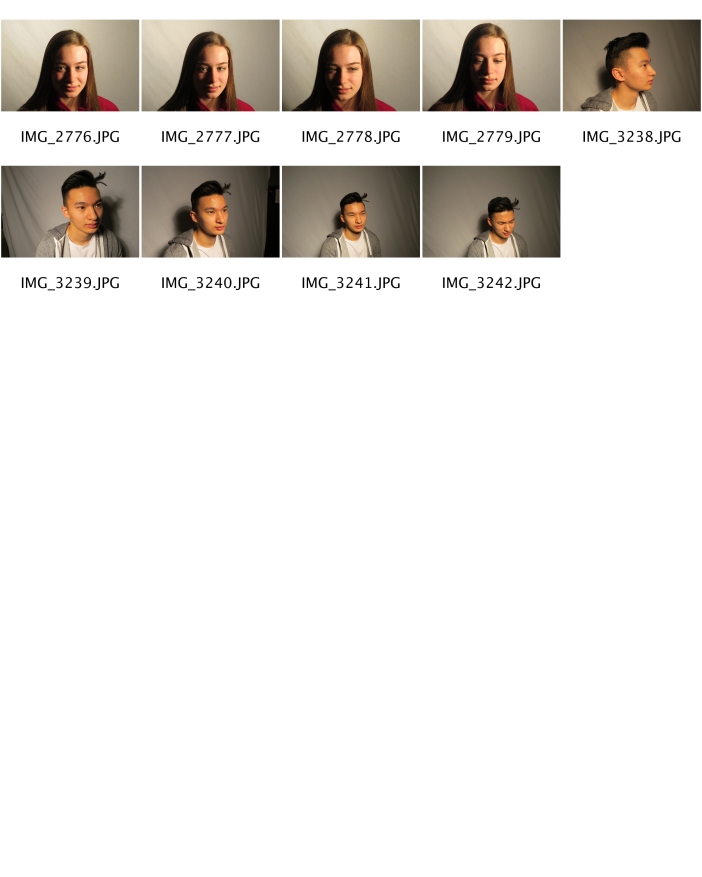
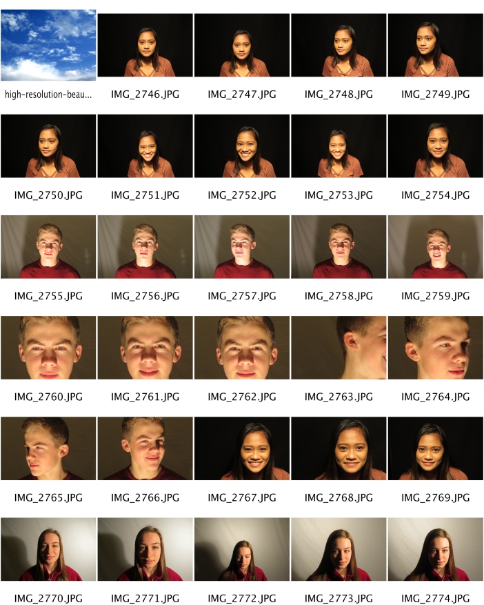
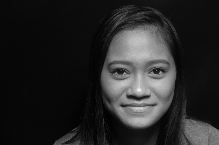
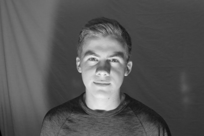
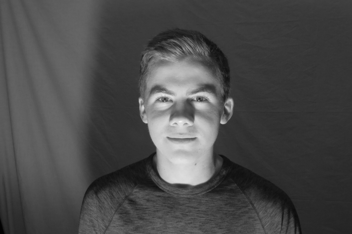
Studio Lighting
Butterfly:
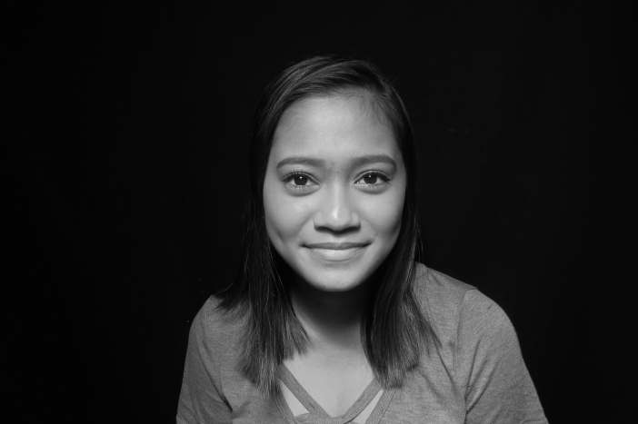
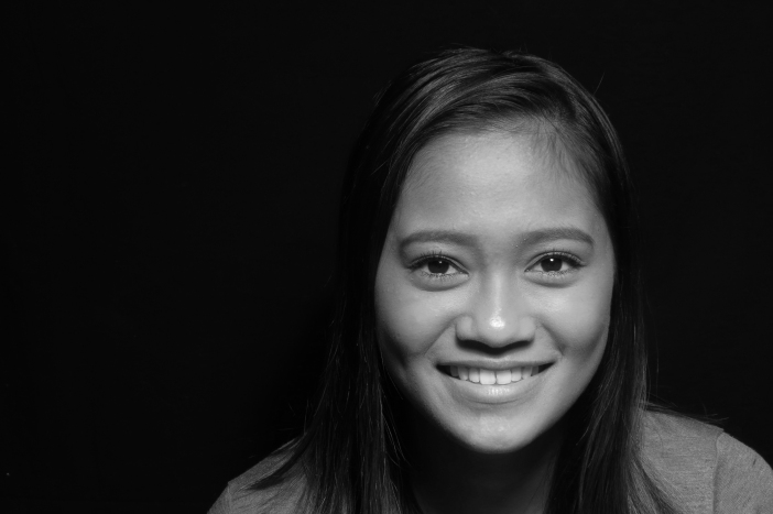

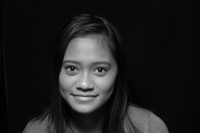
Rembrandt:
Ghoul:
Contact Sheets: